Architecture goes stale fairly quickly, and when it does, it’s painful. What looks cutting edge and futuristic in one era can quickly look dated and of its time a scant decade later. Whenever a slick new building is put up that seems to be on the bleeding edge of design I think to myself how well it will be received in five, ten, or twenty-five years time. How will it look after it’s been used, or when it’s dirty? How will it look with rain splatters all over it, or when it shows signs of habitation? Will it always seem cutting edge, or will it soon seem to be a brief emblem of its time period?
The Oregon State Capitol is a good example of this.

I’m sure it looked quite cutting edge in the late thirties when it was built. Back then the future looked was austere and deco-inspired. Now its merely the blocky remnants of what a past decade thought the future looked like.
The notorious Portland Building is even worse.
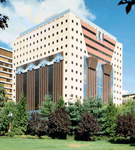
While I do think that hating it is sometimes a fashionable affectation, it’s hard to admit that it doesn’t look of its time. The thing positively bleeds 80s-ness. It’s practically the architectural equivalent of a Patrick Nagel print.
Buildings like this carry a certain embarrassment with them- there is the tacit assumption from the architect, the city planners, the property managers, and everyone else involved with raising them that the conventions of one era will carry over into another. Buildings, after all, generally stick around for longer than people, art installations, wardrobes, or music collections. Once they’re up, we have to deal with their aesthetic choices for some time.
That said, I really enjoyed seeing Seattle’s public library. I don’t, by any means, think that we should just stick with austere, safe modernist or classical designs. I like buildings that have shiny flourishes to them. The above two, though, don’t pull it off very well. Seattle’s library, though, did it a much better.
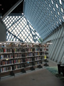
The exterior’s fairly unremarkable, but the inside has all kind of flourishes that actually work pretty well, like the outward-bent window-walls on the second floor.
Not only is it kind of off-kilter, but it also lets tons of natural light into a reading space. It’s functional as well as quirky. There’s also the red halls above that make it look like you’re walking around inside the living guts or some giant creature.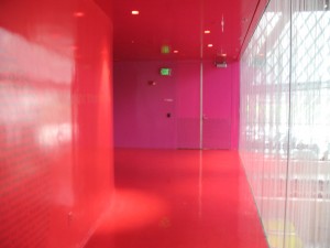
Splashes of dramatic color about, usually contrasting dramatically with each other.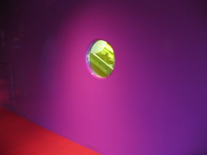
Most dramatically there are the bright yellow escalators which pop out excitedly in front of their dark background.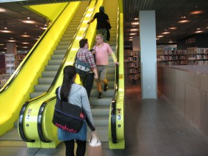
The whole building left me very satisfied that something can look both new and exciting (hopefully) not end up dated and stale in five years time. The building seemed functional and inviting (again, there was lots of light) and nowhere did the weirdness of the design seem to get in the way of the use of the building. What I liked most about it, though, was that it didn’t seem to take itself too seriously.
It seemed as if the designers were self-awaredly attempting to make something that was not necessarily cool or fashionable or futuristic, but fun. Seattle’s library doesn’t try to convince you that it’s the vanguard of a Brave New World or on the bleeding edge of fashion. Instead, it tries to be charming and amusing, and succeeds in doing so. Charm and wit retains their freshness far longer than any attempt at being “cool.” I don’t doubt that the library will continue to amuse visitors, even as the Portland Building languishes, perpetually showing up for the future wearing another decade’s fashions.
